Top 2017 Web Design Trends
b'2017 Seems to be the year to buck norms. Established web design trends are being overturned for a preference on visuals in spite of logic. Designers are heeding to the proven stats on video and custom branding and challenging developers this year with complex design that is not always mobile friendly. Taken to extremes, this could result in an inconsistent user experience across devices as some design elements would only appear on certain devices. In the long run, this sort of complex trend-bucking design could be the motivation software developers need to continue modernizing powerful and smart technology.
\\n
\\nLet\'s take a look at what to expect this year.
\\nCinematography
\\nCinematography can be either videos, GIFs or still photos with repeated animation that run on a continuous loop. This is a fairly simple way to add engagement to a static page and hold interest for more than a couple seconds. High quality cinemagraphs can be found at Flixel. And if done right, they can be lighter than a heavy video file.
\\n
\\n
\\n
\\n
\\n
\\nIn A/B testing, Turnstyle\\xa0compared the effectiveness of a cinemagraph versus a still image on their homepage. It resulted in a 20% increase\\xa0in new visitor conversions, which hints at the power of cinemagraphs.
\\nVirtual Reality & 360 Video
\\nGamers had a heavy influence on VR as it\'s common in the video game industry, yet fairly new to commercial web design. 360 Video allows for a walk through of a campus or office tour and significantly increases web engagement. We\'ll continue to see more VR software emerge, but the most popular include Google\'s VR View. We also like krpano.
\\n
\\nCompanies with aggressive marketing goals should implement this tactic early while it\'s relatively new and impressive.
\\nAsymmetry
\\nAnother web design trend bucked. Interesting visuals are becoming dominant this year without regard to "pretty." This results in content not equally balanced on the left and right sides.
\\nDuotone Gradients
\\nBright duotone gradients are a great way to add visual appeal to an otherwise unimpressive image. Most styles are using just 2 color options, but it can be done in a kaleidoscope of ways. Spotify has already implemented this trend to attract and appeal to a youthful audience.
\\n
\\n
\\nUnique Navigation
\\nOriginal navigation doesn\'t always make the best user experience, but if done well, it can leave a unique lasting impression. It\'s a risk, but designing for a unique header menu or uncommon way to navigate through the site can set the company up as a thought leader. If done poorly, it can simply frustrate the user when they can\'t quickly find content.
\\n
\\n
\\nMicro-interactions
\\nThese are the smaller details of web interaction such as mouse hover animations, scrolling effects and click features. They are a highly effective but overlooked tool to improve user experience. In 2017, designers are spending more time on micro-interactions and putting thought into the end ux.
\\nGeometrics
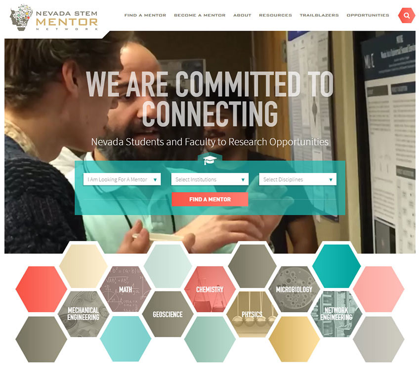
\\nGeometric lines, shapes and patterns are in stark contrast to the flat design styles we\'ve seen the past 2 years. Photos are being cropped to fit inside interesting shapes and designers are thinking outside the box - ahem, square.
\\n
\\nCheck out how we utilized this trend for Nevada STEM Mentor Network....'