Top 2013 Web Design Trends
b'Design, whether it be for clothing or websites, is influenced by the reflection of our culture. And with all the latest technological advances this year, users expect web design to harmoniously interact on their new device, thus a shift in user interface is required. Here are the top 2013 web design trends capable of converting viewers into customers:
\\nContent
\\nOver-sized typography and large headlines support the #1 content-focused 2013 web design trend, making it easy for users to quickly identify and access important information. In order to drive traffic and improve conversion, designs should be developed around content instead of pasting content inside a completed design. Large, bold text conveys the primary message to your visitor without making them look for it.
\\n
\\nFlat Design
\\nDevices have been simplified and minimized in size, therefore designs with bevels, shadows and gradients appear cluttered and overload your user. Stripping away the unnecessaries leaves your site looking fresh, clean and simple and keeps the focus on content.
\\n
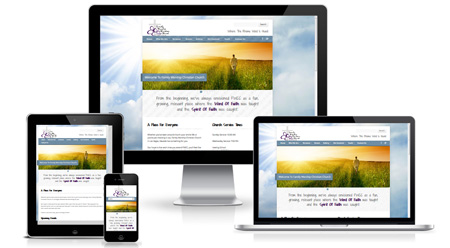
\\nResponsive
\\nAgain, because users view sites on variable platforms, it\'s crucial your site is uniformly visible on laptops, tablets and smartphones. There are over 1 billion smartphone users in the world, so it makes sense for your site to have one existing version that will load flawlessly on whatever new device comes next. Responsive design favors simplicity and your customers will appreciate it, too.
\\n
\\nWhitespace
\\nThe use of whitespace (blank sections on your page, not necessarily white) emphasizes the main message of your website by ridding of distractions. Minimal design is key here, an advantage of which is the reduction of your site\'s load time. On a small device, whitespace lends to a reduction of clutter for your user. With only one focus point, your customer\'s attention is easily captured right where you want it to be.
\\n
\\nFixed Header (aka Navigation)
\\nThis new 2013 web design trend offers a constant compass on your website and quickly navigates your users back to your homepage. It also serves as a modern visual paired with exceptional functionality. A site\'s ease of navigation often makes or breaks your visitor\'s experience.
\\n
\\nSocial Media Icons
\\nPositioning icons from social media networks like Facebook, Twitter and Linkedin are a highly effective marketing technique this year, and likely for the years to follow. These are actively used by readers who want to quickly share content and information. You can be certain by fixing social media icons to blogs and articles, that the chances of your content being re-posted increases dramatically.
\\n
\\nGrid Layout ("Metro")
\\nWith a focus on content-first design and the popularity of the Windows 8 "Metro" scheme, websites are moving toward a grid-style layout of variable colors, sizes and effects. Separating content with boxes creates an intuitive, easy-to-navigate user experience that narrows their options upon first glance and shepherds your customers into clicking.
\\n
\\n
\\nLarge Images
\\nIt used to be only photographers used over-sized photos and images as their site\'s background. However, using a large, sharp image helps your visitors identify who you are and what products/services you have to offer. This trend is particularly useful to design businesses such as portfolio, photography and website design.
\\n
\\nSingle Page Web Design
\\nThe move toward a single page website is an excellent way to improve your...'